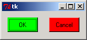
Setting up the widgets and controlling their appearance and location.
from Tkinter import *

class MyApp:
  def __init__(self, parent):

    button_width = 6

    button_padx = "2m"
    button_pady = "1m"

    buttons_frame_padx =  "3m"
    buttons_frame_pady =  "2m"
    buttons_frame_ipadx = "3m"
    buttons_frame_ipady = "1m"

    self.myParent = parent
    self.buttons_frame = Frame(parent)

    self.buttons_frame.pack(
      ipadx=buttons_frame_ipadx,
      ipady=buttons_frame_ipady,
      padx=buttons_frame_padx,
      pady=buttons_frame_pady,
      )


    self.button1 = Button(self.buttons_frame, command=self.button1Click)
    self.button1.configure(text="OK", background= "green")
    self.button1.focus_force()
    self.button1.configure(
      width=button_width,
      padx=button_padx,
      pady=button_pady
      )

    self.button1.pack(side=LEFT)
    self.button1.bind("<Return>", self.button1Click_a)

    self.button2 = Button(self.buttons_frame, command=self.button2Click)
    self.button2.configure(text="Cancel", background="red")
    self.button2.configure(
      width=button_width,
      padx=button_padx,
      pady=button_pady
      )

    self.button2.pack(side=RIGHT)
    self.button2.bind("<Return>", self.button2Click_a)

  def button1Click(self):
    if self.button1["background"] == "green":
      self.button1["background"] = "yellow"
    else:
      self.button1["background"] = "green"

  def button2Click(self):
    self.myParent.destroy()

  def button1Click_a(self, event):
    self.button1Click()

  def button2Click_a(self, event):
    self.button2Click()


root = Tk()
myapp = MyApp(root)
root.mainloop()
Related examples in the same category
| 1. | Layout: anchor NW, W and E | |  |
| 2. | Layout: anchor W side TOP | | 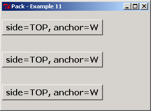 |
| 3. | Layout: side TOP, LEFT | | 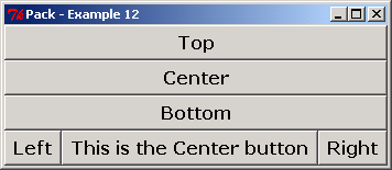 |
| 4. | Layout: side TOP and LEFT | | 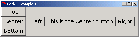 |
| 5. | Layout: LEFT LEFT and LEFT | | 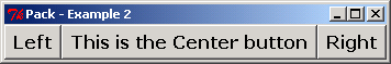 |
| 6. | Layout: fit text side | | 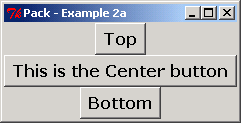 |
| 7. | Layout: side TOP LEFT LEFT | | 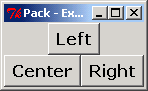 |
| 8. | Layout: frame fill BOTH expand YES | | 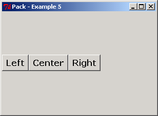 |
| 9. | Layout: pack side LEFT and expand YES | |  |
| 10. | Layout: TOP, CENTER and BOTTOM | |  |
| 11. | Layout: top, center and bottom fill | |  |
| 12. | Layout: side LEFT and fill | |  |
| 13. | Layout: fill X | | 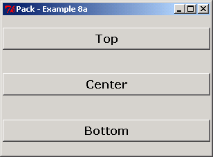 |
| 14. | Layout: fill X and Expand YES NO | | 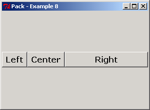 |
| 15. | Layout: fill X and expand YES | | 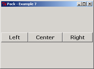 |
| 16. | Layout: side TOP and fill X | | 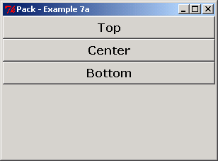 |
| 17. | Use layout: fill | |  |
| 18. | Use pack for a frame | |  |
| 19. | Set expand to YES and fill to BOTH | |  |
| 20. | Add a label to the top of a frame | |  |
| 21. | Add a label to the center of a frame | |  |
| 22. | Adds multi-widget layouts: TOP, RIGHT and LEFT | | 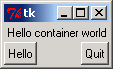 |
| 23. | Alternative packing/clipping order: LEFT, RIGHT and TOP | |  |
| 24. | Creation order irrelevant to clipping | |  |
| 25. | Packing order and sides determine layout: make parents expandable | |  |
| 26. | Use anchor to position, instead of fill to stretch | |  |
| 27. | Layout button in a row with different padx | |  |
| 28. | Layout components in grid | |  |
| 29. | Layout three button in a row | |  |
| 30. | Pack side in TOP | |  |
| 31. | Nested containers | |  |
| 32. | Creating a GUI object and associating it with its parent: packing, containers vs. widgets | |  |
| 33. | Using the grid geometry manager | |  |
| 34. | Set positions for components | |  |
| 35. | Pack side RIGHT and LEFT | |  |
| 36. | Pack layout manager:Button component placed against top of window | |  |
| 37. | Pack layout manager: component placed against bottom of window, fills all available vertical and horizontal space | |  |
| 38. | Component Placed against left side of window, fills all available horizontal space | | |
| 39. | Component Placed against right side of window, fills all available vertical space | |  |