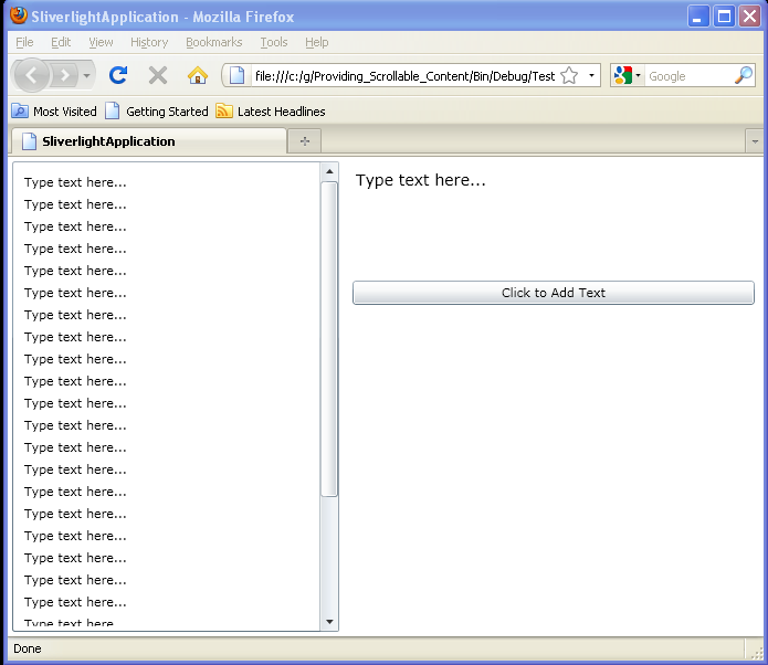
Providing Scrollable Content
<UserControl x:Class='SilverlightApplication3.MainPage'
    xmlns='http://schemas.microsoft.com/winfx/2006/xaml/presentation'
    xmlns:x='http://schemas.microsoft.com/winfx/2006/xaml'
    xmlns:d='http://schemas.microsoft.com/expression/blend/2008'
    xmlns:mc='http://schemas.openxmlformats.org/markup-compatibility/2006'
    mc:Ignorable='d'
    d:DesignWidth='640'
    d:DesignHeight='480'>
  <Grid x:Name="LayoutRoot" Background="White">
    <Grid.RowDefinitions>
      <RowDefinition Height="*"/>
    </Grid.RowDefinitions>
    <Grid.ColumnDefinitions>
      <ColumnDefinition Width="0.4*"/>
      <ColumnDefinition Width="0.5*"/>
    </Grid.ColumnDefinitions>
    <ScrollViewer Margin="4,4,4,4" HorizontalScrollBarVisibility="Auto"
     VerticalScrollBarVisibility="Auto">
      <StackPanel x:Name="spText" Margin="4,4,4,4"></StackPanel>
    </ScrollViewer>
    <StackPanel Margin="4,4,4,114" Grid.Column="1">
      <TextBox x:Name="typedText" Height="96" Text="Type text here..."
      TextWrapping="Wrap" FontSize="14" Margin="4,4,4,4" BorderThickness="0"/>
      <Button x:Name="AddText" Content="Click to Add Text" Margin="4,4,4,4"
       Click="AddText_Click"/>
    </StackPanel>
  </Grid>
</UserControl>

//File: Page.xaml.cs
using System.Windows;
using System.Windows.Controls;

namespace SilverlightApplication3
{
  public partial class MainPage : UserControl
  {
    public MainPage()
    {
      InitializeComponent();
    }

    private void AddText_Click(object sender, RoutedEventArgs e)
    {
      TextBlock text = new TextBlock();
      text.Text = typedText.Text;
      text.Margin = new Thickness(2, 2, 2, 2);
      spText.Children.Add(text);
    }
  }
}
Related examples in the same category