Mixing row height styles : Grid « Containers « Silverlight


Mixing row height styles

Mixing row height styles
    

<UserControl x:Class='SilverlightApplication3.MainPage'
    xmlns='http://schemas.microsoft.com/winfx/2006/xaml/presentation' 
    xmlns:x='http://schemas.microsoft.com/winfx/2006/xaml'
    xmlns:d='http://schemas.microsoft.com/expression/blend/2008' 
    xmlns:mc='http://schemas.openxmlformats.org/markup-compatibility/2006' 
    mc:Ignorable='d' 
    d:DesignWidth='640' 
    d:DesignHeight='480'>
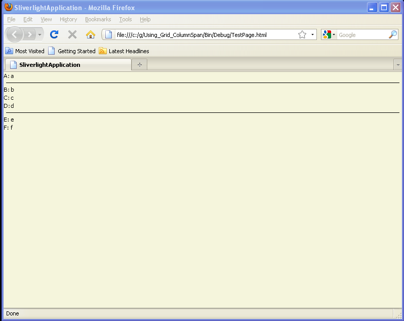
<Grid ShowGridLines="True">
  <Grid.Resources>
    <Style TargetType="TextBlock">
      <Setter Property="Margin" Value="5,3" />
    </Style>
  </Grid.Resources>

  <Grid.ColumnDefinitions>
    <ColumnDefinition Width="Auto" />
    <ColumnDefinition />
  </Grid.ColumnDefinitions>
  <Grid.RowDefinitions>
    <RowDefinition Height="Auto" />
    <RowDefinition Height="2*" />
    <RowDefinition Height="1*" />
  </Grid.RowDefinitions>
  <TextBlock Grid.Column="0" Grid.Row="0">Key:</TextBlock>
  <TextBlock Grid.Column="1" Grid.Row="0">Value</TextBlock>
  <TextBlock Grid.Column="0" Grid.Row="1">A:</TextBlock>
  <TextBlock Grid.Column="1" Grid.Row="1">a</TextBlock>
  <TextBlock Grid.Column="0" Grid.Row="2">B:</TextBlock>
  <TextBlock Grid.Column="1" Grid.Row="2">b</TextBlock>

</Grid>

</UserControl>


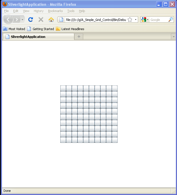
Related examples in the same category

1.Positioning UI Elements with a GridPositioning UI Elements with a Grid
2.A Simple Grid ControlA Simple Grid Control
3.Span two rows and two columns with an Image control
4.Implementing a Grid to Set the Layout of Silverlight Controls
5.Grid exampleGrid example
6.ColumnSpan exampleColumnSpan example
7.Grid example 2* row and column definitionsGrid example 2* row and column definitions
8.Use Grid to layout a CalendarUse Grid to layout a Calendar
9.Set Grid Row and Column for a Button
10.Grid with Column Definition and Row definitionGrid with Column Definition and Row definition
11.Define rows / columns for GridDefine rows / columns for Grid
12.Using Grid.ColumnSpanUsing Grid.ColumnSpan
13.Set Grid Row Height and Column Width to AutoSet Grid Row Height and Column Width to Auto
14.Show Grid LinesShow Grid Lines
15.Multiple Items in a Grid CellMultiple Items in a Grid Cell
16.Grid in ScrollViewerGrid in ScrollViewer
17.Margin vs Padding and Grid
18.ColumnDefinition.Width=Auto
19.Bind to Grid Width and Height
20.Set Row and Column Index when Adding Buttons to Grid
21.Put more than one Object to one Grid Cell
22.Set Column and Row index when adding Controls to a Grid
23.Empty RowDefinition and ColumnDefinition
24.Use the Grid element to create a standard user interface (UI) dialog box.
25.Place and size rectangles and ellipses in Grid cellsPlace and size rectangles and ellipses in Grid cells
26.Use Image as the Grid backgroundUse Image as the Grid background
27.Automatic Width and HeightAutomatic Width and Height
28.Layout Controls with Grid in codeLayout Controls with Grid in code
29.Set control to specific row and column in codeSet control to specific row and column in code
30.Show Grid lines in codeShow Grid lines in code
31.A basic Grid using star sizing.A basic Grid using star sizing.
32.A basic Grid using auto sizingA basic Grid using auto sizing
33.The basic syntax of a GridThe basic syntax of a Grid
34.Arranging content within a GridArranging content within a Grid
35.Proportional GridProportional Grid
36.Nested GridsNested Grids
37.Grid cell stretch modeGrid cell stretch mode
38.Programmatically adding a row and a column while setting the height and widthProgrammatically adding a row and a column while setting the height and width
39.Programmatically removing a row and a columnProgrammatically removing a row and a column
40.The basic syntax and usage of a GridSplitterThe basic syntax and usage of a GridSplitter
41.Star sizing GridStar sizing Grid
42.Grid mouse button up eventGrid mouse button up event