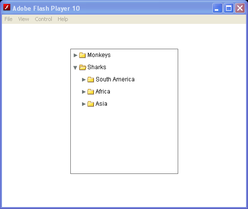
| 1. | Using showRoot property to start the display from the second level | |  |
| 2. | Get selected item from Tree | |  |
| 3. | Add selected value from Tree and add it to List | |  |
| 4. | Get selected label for Tree item | |  |
| 5. | Open nodes in the Tree control based on the values of query string parameters | |  |
| 6. | Add icon fields to Tree | |  |
| 7. | Using the setItemIcon() method for Tree control | |  |
| 8. | depth color for Tree style | |  |
| 9. | alternatingItemColors for Tree style | |  |
|
| 10. | Set depthColors for Tree control through xml attribute | |  |
| 11. | set alternatingItemColors for Tree control through xml attribute | |  |
| 12. | Use Label for Tree labelField | |  |
| 13. | Drag and drop on a Tree | |  |
| 14. | Search a Tree | |  |
| 15. | Expand tree node | |  |
| 16. | Drill Into Tree | |  |
| 17. | Specify an icon displayed with each Tree leaf when you populate it by using XML | |  |
| 18. | Tree Item Icon | |  |
| 19. | Tree Open Node | |  |
| 20. | Use style to set tree node open duration | |  |
| 21. | Define Arrays of colors for properties of the Tree type selector | |  |
| 22. | Use groupIconFunction to display a custom icon for navigation tree top level node | |  |
| 23. | Creating a separate column for the navigation tree | |  |