Home
Flex
Chart
Components
Container
Data Model
Development
Effects
Event
Graphics
Grid
Style
Spark component « Components « Flex
Flex
Components
Spark component
1.
Basic format of an MXML application that uses the Spark component set
2.
Use MX DataGrid with Spark Application, VerticalLayout, and Button components
3.
Use id to reference control
4.
Id property for Button
5.
Create a Spark Button control in MXML.
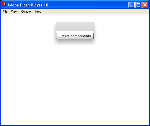
6.
Set control to visible
7.
nonzero padding and gaps
8.
Percetage width
9.
Set min width
10.
Get UI controls's width
11.
Visible properties
12.
Percentage-based sizing
13.
Using various Alpha properties
14.
Using the id property with MXML tags
15.
Set component properties as tag attributes
16.
Set the property using the value of the static constant
17.
Explicitly specify the default property
18.
Use ActionScript String to insert a newline character
19.
Convert calculation result to String and set to Label
20.
Use this[control label] to reference controls declared
21.
Id property for Control
22.
Call the initDate() function and writes a message in flexlog.txt
23.
Log the component sizes to flashlog.txt
24.
Use width and height properties to explicitly set its size
25.
Convert object to Flex Display Object
26.
Create Components From Descriptors
27.
Use percentage to control the width
28.
Setting enabled to false makes a component unavailable.
29.
visible controls whether an item is visible on stage
30.
Border properties set in MXML mark-up
31.
Use child tags with the dot notation to define property overrides
32.
Use the x and y properties to reposition a Button control
33.
Set Pane and Button properties
34.
A linker dependency on the Button control
![Use this[control label] to reference controls declared](http://www.java2s.com/Code/FlexImages/Usethiscontrollabeltoreferencecontrolsdeclared.PNG)