| 16.6.Button |
| 16.6.1. | Rotated Buttons | 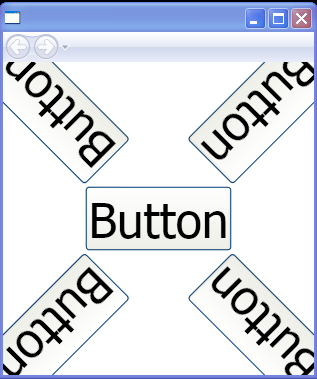 |
| 16.6.2. | Pendulum Button | 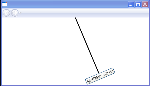 |
| 16.6.3. | Set Button Content with element value |  |
| 16.6.4. | Set Button Width,Height and Content String by using Attributes |  |
| 16.6.5. | Use Button.Content to set the content for a Button | 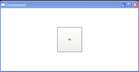 |
| 16.6.6. | Adding image to a Button | 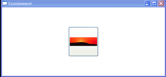 |
| 16.6.7. | Button with no position and size | 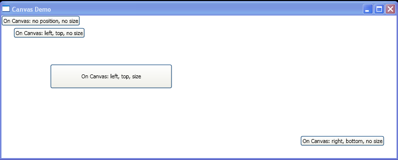 |
| 16.6.8. | Button with Property Attributes |  |
| 16.6.9. | Button with Property Elements |  |
| 16.6.10. | Button with default Xml namespace |  |
| 16.6.11. | Button with named Namespace |  |
| 16.6.12. | Button Based On Style | 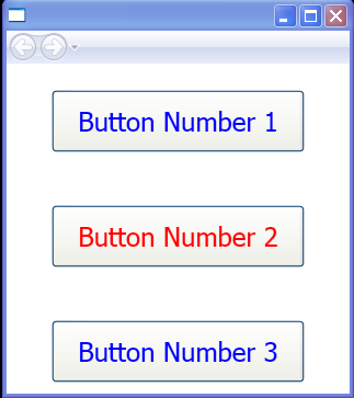 |
| 16.6.13. | Property Trigger for Button | 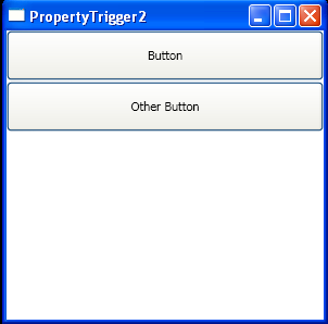 |
| 16.6.14. | Layout Tranform |  |
| 16.6.15. | Using alternate elements as the content of a Button | 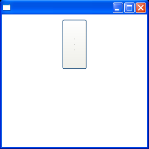 |
| 16.6.16. | Button's Background = ImageBrush. The resulting button has an image as its background | 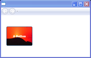 |
| 16.6.17. | A rotated Button | 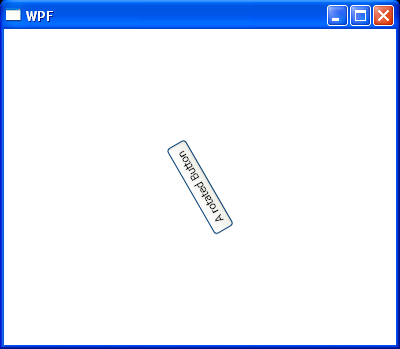 |
| 16.6.18. | Using Button.Content to set content for Button |  |
| 16.6.19. | A button that has been skewed and rotated |  |
| 16.6.20. | Button PreviewMouseDown action and MouseDown action |  |
| 16.6.21. | Add CommandTarget for Button |  |
| 16.6.22. | Adding graphics to a Button | 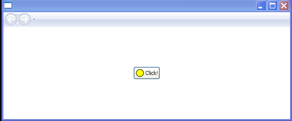 |
| 16.6.23. | Button with image and text, use grid to layout Button content | 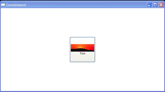 |
| 16.6.24. | Canvas with Button on | 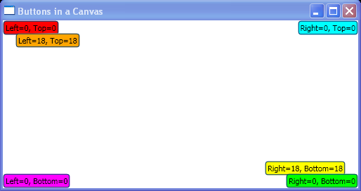 |
| 16.6.25. | Resizing Buttons | 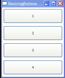 |
| 16.6.26. | To add a button control and a text block to the canvas | 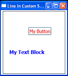 |
| 16.6.27. | A simple template for a round button | 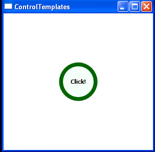 |
| 16.6.28. | Load style defined in Xaml and apply to the Button | 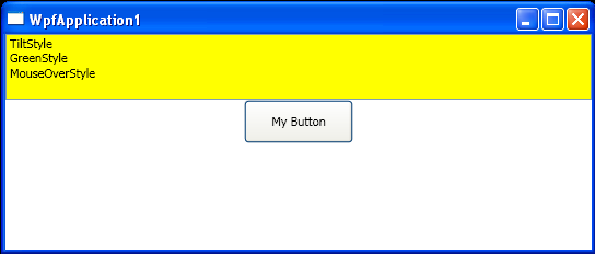 |
| 16.6.29. | Nested Button content | 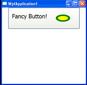 |
| 16.6.30. | Two repeat buttons that increase and decrease a numerical value. | 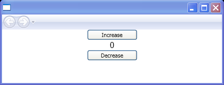 |
| 16.6.31. | Set button properties with Linq style | 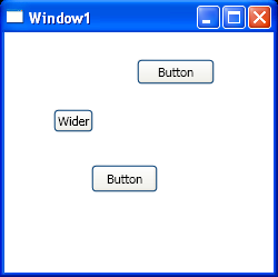 |
| 16.6.32. | Simple Custom Button | 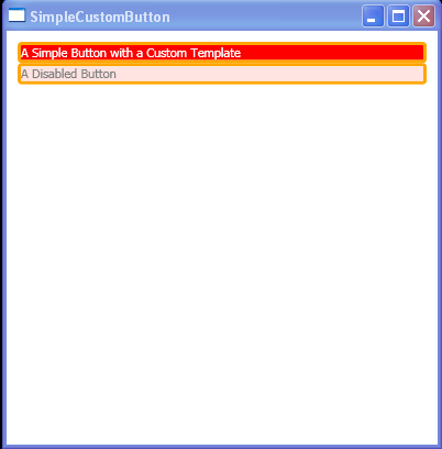 |
| 16.6.33. | Button VerticalAlignment=Top HorizontalAlignment=Left | 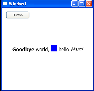 |