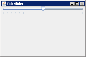
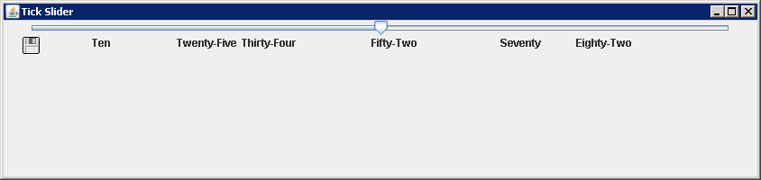
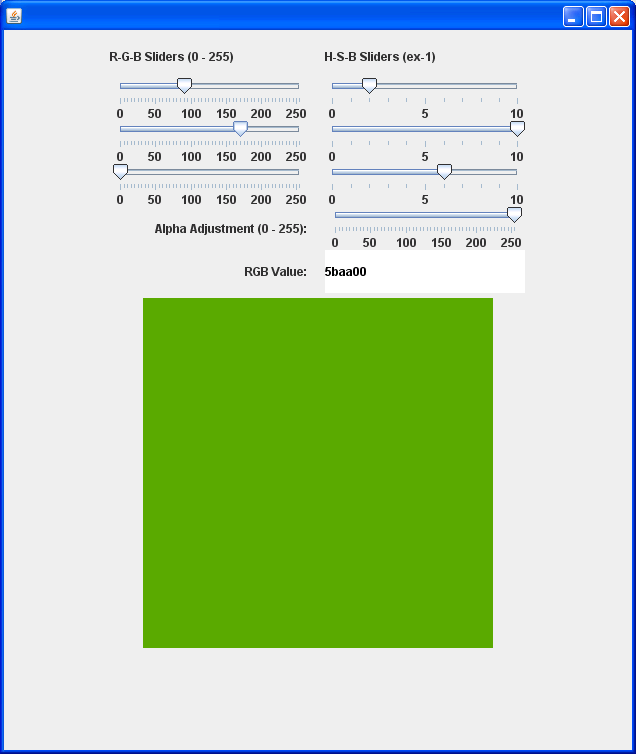
14.30.JSlider |
| 14.30.1. | JSlider Introduction |
| 14.30.2. | JSlider lets the user graphically select a value by sliding a knob within a bounded interval. |
| 14.30.3. | Creating a JSlider Component |
| 14.30.4. | Create a horizontal slider with custom min, max, and value |
| 14.30.5. | Create a vertical slider with min=0, max=100, value=50 |
| 14.30.6. | Create a vertical slider with custom min, max, and value |
| 14.30.7. | Listening for Value Changes in a JSlider Component |
| 14.30.8. | Tracking changes to a JSlider with a ChangeListener |  |
| 14.30.9. | Displaying Tick Marks Within a JSlider |  |
| 14.30.10. | Snapping the JSlider Thumb into Position |  |
| 14.30.11. | Labeling JSlider Positions: use text to mark JSlider |  |
| 14.30.12. | Setting ThumbIcon for JSlider |  |
| 14.30.13. | JSlider Client Properties: JSlider.isFilled |  |
| 14.30.14. | Slider change event |
| 14.30.15. | Use Slider to control the color R G B value |  |
| 14.30.16. | AdjustmentListener and ChangeListener for JSlider |
| 14.30.17. | Move the slider by a fixed amount: the extent. |
| 14.30.18. | Get the extent |
| 14.30.19. | Getting and Setting the Values of a JSlider Component |
| 14.30.20. | Set major tick marks every 25 units |
| 14.30.21. | Set minor tick marks every 5 units |
| 14.30.22. | Set to a spot between tick marks; the value moves to closest tick mark |
| 14.30.23. | Set the value; the new value will be forced into the bar's range |
| 14.30.24. | Set the extent |
| 14.30.25. | Set all the values at once by using the model |
| 14.30.26. | Make it vertical and move bottom-to-top |
| 14.30.27. | Make it vertical and move top-to-bottom |
| 14.30.28. | Make the horizontal slider move right-to-left |
| 14.30.29. | Create a dynamic icon |
| 14.30.30. | Hide the track |
| 14.30.31. | Show tick marks |
| 14.30.32. | Change the minimum value |
| 14.30.33. | Change the maximum value |
| 14.30.34. | Snap to tick marks |
| 14.30.35. | Constraining JSlider Component Values to Tick Marks |
| 14.30.36. | Determine if currently snapping to tick marks |
| 14.30.37. | Determine if currently painting labels |
| 14.30.38. | A slider with tick marks and labels |
| 14.30.39. | The slider allows you to use an arbitrary label at any particular major tick mark. |
| 14.30.40. | Customizing a JSlider Look and Feel |