Home
Java Tutorial
Language
Data Type
Operators
Statement Control
Class Definition
Development
Reflection
Regular Expressions
Collections
Thread
File
Generics
I18N
Swing
Swing Event
2D Graphics
SWT
SWT 2D Graphics
Network
Database
Hibernate
JPA
JSP
JSTL
Servlet
Web Services SOA
EJB3
Spring
PDF
Email
J2ME
J2EE Application
XML
Design Pattern
Log
Security
Apache Common
Ant
JUnit
Customizing JCheckBox Look and Feel : JCheckBox « Swing « Java Tutorial
Java Tutorial
Swing
JCheckBox
Property String
Object Type
CheckBox.background
Color
CheckBox.border
Border
CheckBox.darkShadow
Color
CheckBox.disabledText
Color
CheckBox.focus
Color
CheckBox.focusInputMap
Object[ ]
CheckBox.font
Font
CheckBox.foreground
Color
CheckBox.gradient
List
CheckBox.highlight
Color
CheckBox.icon
Icon
CheckBox.interiorBackground
Color
CheckBox.light
Color
CheckBox.margin
Insets
CheckBox.rollover
Boolean
Checkbox.select
Color
CheckBox.shadow
Color
CheckBox.textIconGap
Integer
CheckBox.textShiftOffset
Integer
CheckBoxUI
String
14.11.JCheckBox
14.11.1.
Creating JCheckBox Components
14.11.2.
Using JCheckBox
14.11.3.
JCheckBox.setMnemonic
14.11.4.
Listening to JCheckBox Events with an ActionListener
14.11.5.
Listening to JCheckBox Events with an ItemListener
14.11.6.
Listening to JCheckBox Events with a ChangeListener: listen to armed, pressed, selected, or released state
14.11.7.
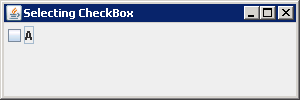
Check if a JCheckBox is selected in its item change listener
14.11.8.
Event firing sequence: ActionListener, ItemListener and ChangeListener
14.11.9.
Adding an Icon to the Label of a JCheckBox Component
14.11.10.
Getting and Setting the State of a JCheckbox Component
14.11.11.
Display an icon when the cursor is moved over the checkbox. This is called the rollover icon.
14.11.12.
Customizing JCheckBox Check Mark Icon
14.11.13.
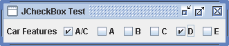
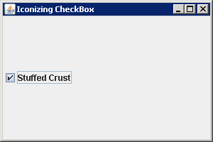
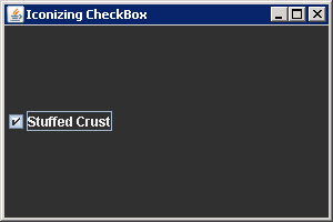
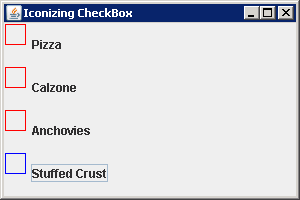
Customizing JCheckBox Look and Feel
14.11.14.
CheckBox List